MetaChat is an informal place for MeFites to touch base and post, discuss and
chatter about topics that may not belong on MetaFilter. Questions? Check the FAQ. Please note: This is important.
21 May 2006
Press kits are hard. At least for us. Especially because we're camera shy. Help me pick a photo to clean up and include in our kit!
We took three rolls of film and there's only about 8 to choose from. I'm busted for being on the web, so I've got to go now, but maybe it's for the best so I don't interfere with your process. Heh. Um...if you need a soundtrack for choosing, may I make a recommendation (mp3, right click - save as)? I'm totally serious in asking for the help; at this point, they all look the same to me now. Thanks.
There are a few of them that are so good that I wouldn't be able to decide either! Tough choice. Which one are you, safetyfork? I'm guessing the shorn one.
Here are the ones I love, in no particular order: 1 2 3
Iconomy's #3 is my number one. Especially in print, the text will wrap around the vertical photograph and make it look longer. Kinda like a sock in the pants ;-P
I vote number 8, with number 7 as a runner-up. I suppose it'd be dictated by whatever layout you're putting it with - if you're putting type with the photo, then it'd depend on whether you were going to have the text underneath or perhaps on the right of the photo.
I really like the fourth one. It's random and you all look so relaxed with each other. I think it's also the most interesting. Eight is my runner up. Good luck!
Oh! I have a lot to say about this (heh)... First of all, the levels need to be adjusted on most of these... but, if I were looking at all of them and picking one to use in a page layout or something, I think I might do this with #8:
The most interesting me as-is (no cropping, etc.) is number 5. I like the asymmetry, the movement, the strong solids in the background, the opposite gaze directions. However, it's also one of the hardest to work with in terms of cropping and adaptability to different print dimensions.
Also, safetyfork, you have a bad habit of having things randomly grow out of your head; this would need to be fixed in photo 5, and cropped off the back of your head in photo 8.
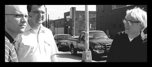
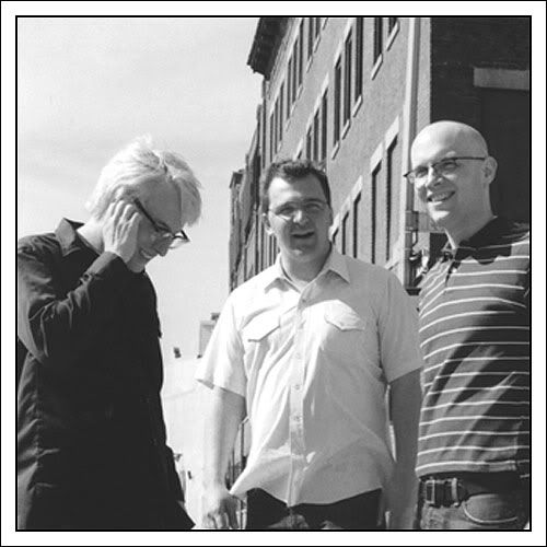
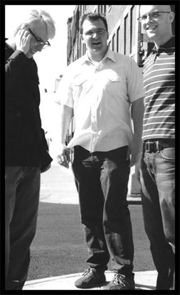
I don't like the fussy backgrounds on 1 & 2; three is fun, but you can't see the other guy (also, warning: safetyfork head growths!). On #4, again I find the background too distracting, and there's very little wriggle room on cropping here. Six: too mean :). I like #9, which would be interesting cropped as a strong horizontal, or as a square, like this:
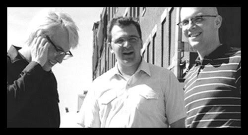
But, hands-down, the most flexible of them all is #7. It has a nice strong, simple background, it shows all three of you, and it can be cropped for any dimension requirements:
So, if you are going for one single photo, that would be the one. It becomes much more interesting with some cropping though, so you hope that whoever is using it has some skillz that way instead of just plopping it down as-is.
If you are doing a web version of your press kit, I could give you cropped versions of any of these to offer.
Wow, taz! Thanks for the thorough and illustrated analysis. I really appreciate it. I'm most definitely going to adjust the levels on the one or two that we keep for the press kits. This includes possibly rescanning as well. I would expect the kit layout to have an effect on the croppage, but we're not there yet. But that is soon in the process, so I'll keep that in mind and the examples are helpful.
From what I'm hearing from the metachatcrew, 007 and 008 look to be the leaders & the maybe slots are occupied by 005 and 009.
PS. I've always had trouble with random things growing outta my brain. :)
Also, no disrespect to my friend, but next time we'll probably want to do this with a more accomplished photographer -- and considering we weren't the most cooperative of subjects I think she did alright.
Oh, any photographer (except dashiv) has to shoot a buttload of film to come up with a single really good one, unless the subject(s) is/are freakishly photogenic, so - definitely no slam on the photographer!
My votes? 4, 5, 6 and 10, but not in any order. Those are the pics that I think have the most personality in them. That last one could be an album cover.
taz, I didn't think anyone here was slammin' the photog, I just wanted to make sure it didn't sound like I was guilty of that while I was simultaneously suggesting that next time we'd ask someone with more experience doing this sort of thing (herding cats and taking photos of them).
danostuporstar, I remember rcade but hadn't made that connection. They do look alot alike!
 photo by splunge
 photo by TheophileEscargot
 photo by Kronos_to_Earth
 photo by ethylene
